ATTENTIVE ICONS & ILLUSTRATIONS
Rethinking Attentive’s iconography and illustration systems to create a harmonious, ownable aesthetic.
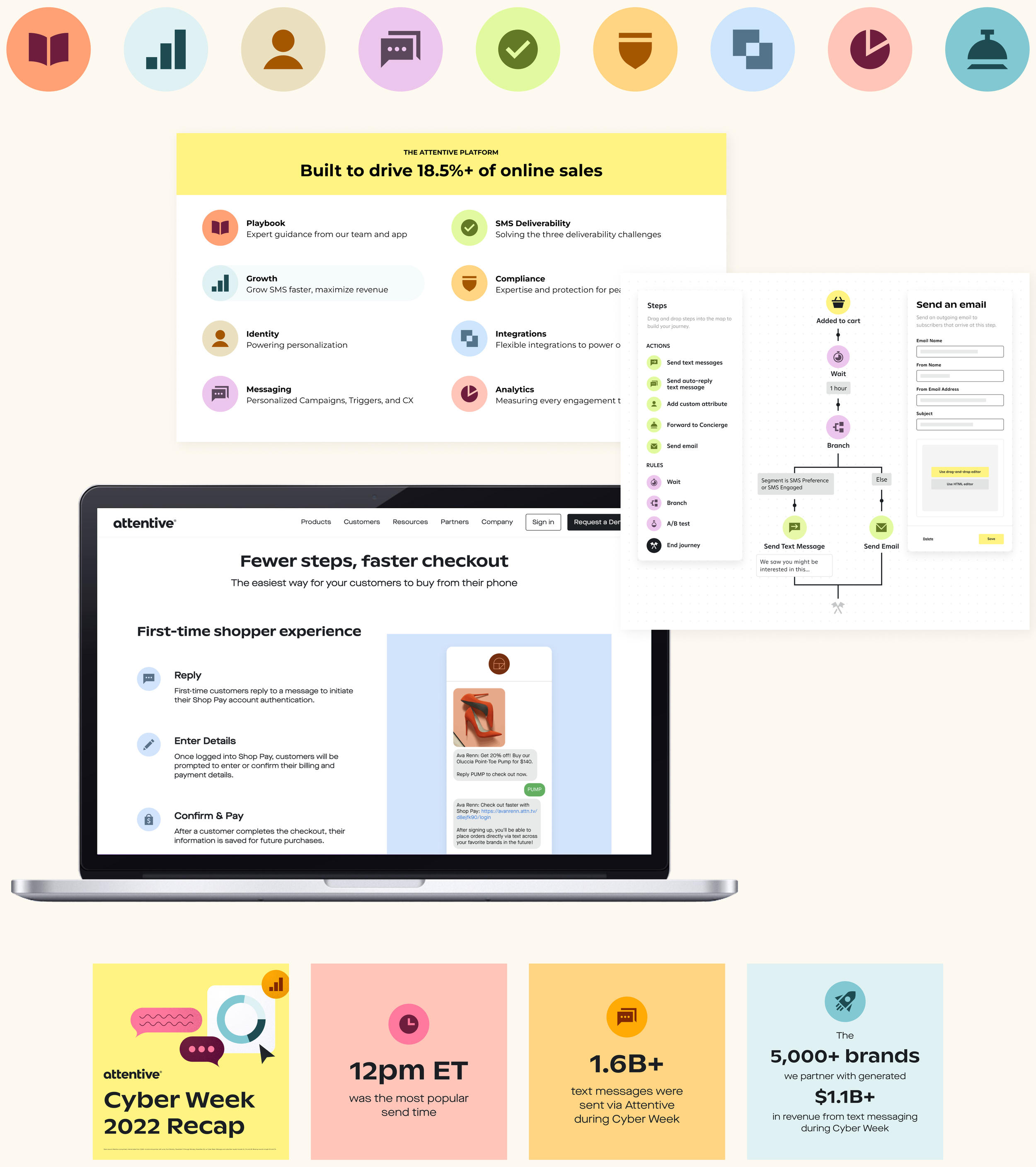
As part of the larger rebrand, I built Attentive a net new set of icons to be used both in the product and across marketing materials. The icons are characterized by their high contrast, inspired by glyphs of Attentive’s brand font, Ginto Nord. It was essential for the icons to play well with every element of the brand, but especially the illustrations, which were also completely rethought. Every illustration is built in-house in alignment with the system’s four key elements: organic shapes, spare linework, subtle grain texture, and the brand’s expansive color palette.
ICON SET
ICONS IN USE
ILLUSTRATIONS

BLOG ILLUSTRATIONS